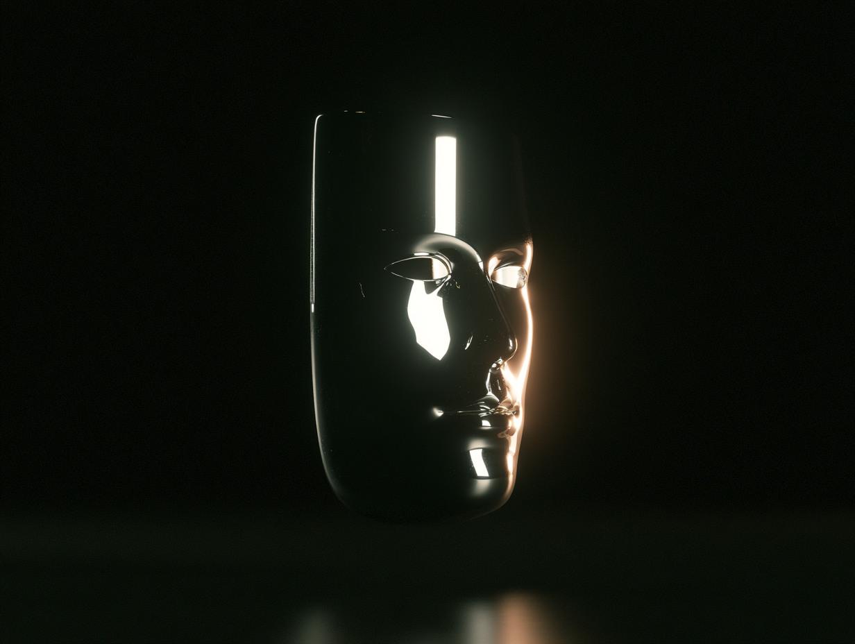
The Digital Face: A website is the brand’s digital counterpart
Speed and motion: the language of the first second
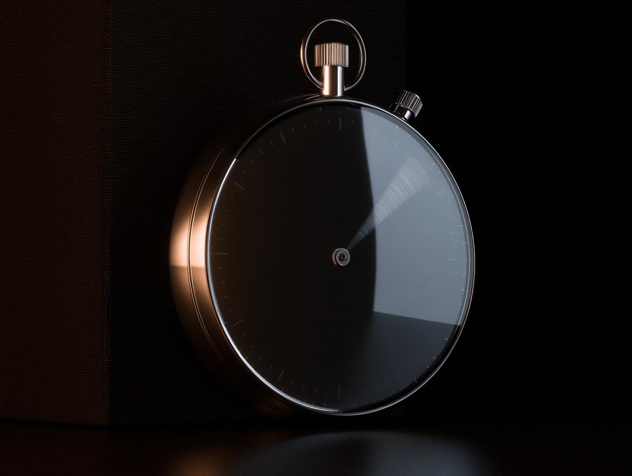

While the visitor decides, the stopwatch is already running: if the site does not open within the first second, the brand has been silenced before it could speak. Speed is not a technical detail; it is the first impression itself.
Motion is not ornament either; it is a language that guides under the cursor, conveying order and importance. On a well-built site, animation tells you where to look — it does not distract.
Typography and words: the site’s tone of voice
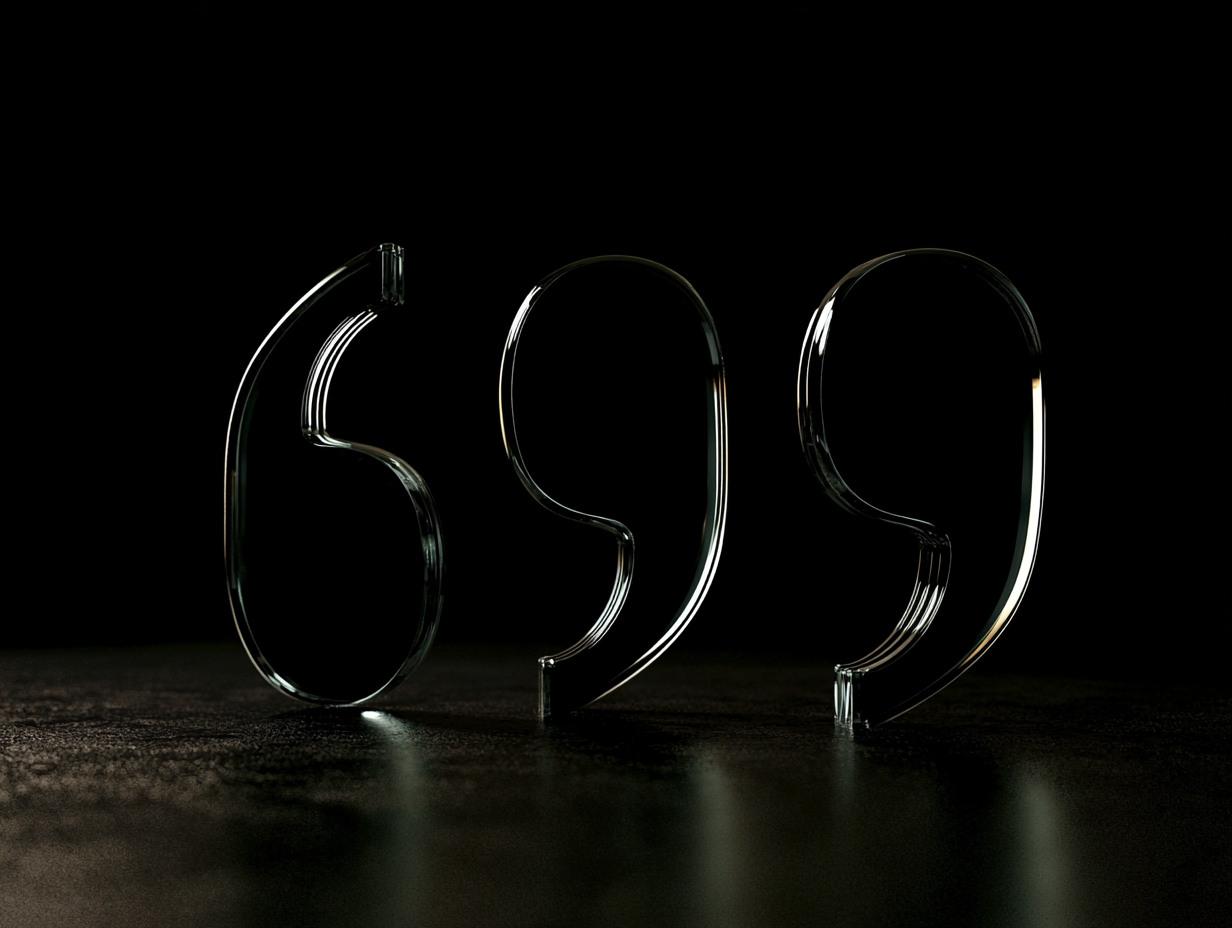

On a website the brand speaks mostly through text. Typeface, line length and spacing set the tone of what is said. The same sentence reads cheap in careless typesetting and trustworthy in disciplined typesetting.
A good typographic system is like an optical cube: it refracts every piece of content that enters through the same order, turning it into hierarchy. Once the system is built, adding a new page is not a design decision but production work.
Mobile: the brand’s face in the pocket
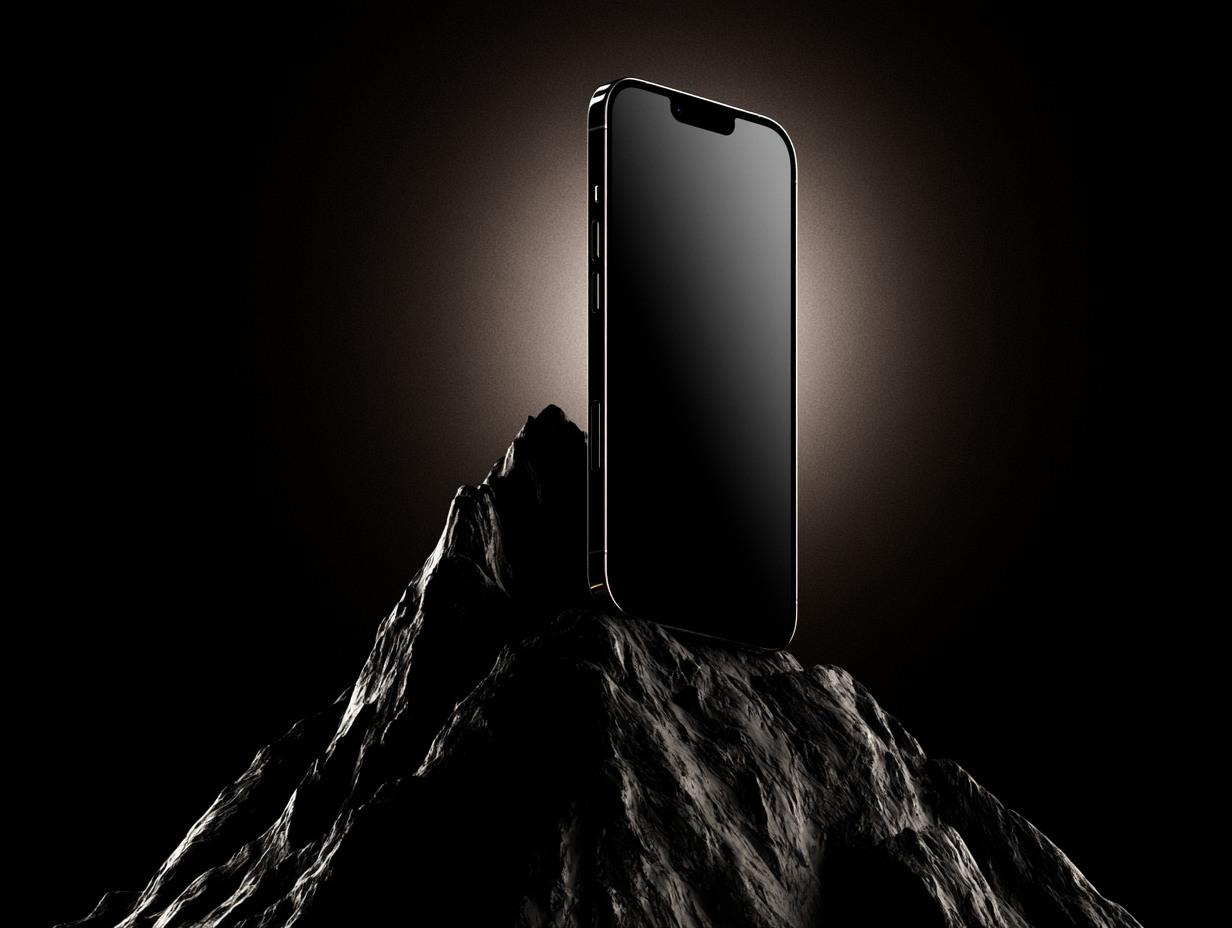
Most traffic now comes from the pocket; the mobile version of the site is not an adaptation but the primary face where the brand meets most people. The phone reaches the summit first.
That is why a site is not a project finished the day it goes live but a medium whose real work begins that day: it is measured, updated, and grows with the brand.
More articles
All articles →Previous article

The Visible Line of Export: Brand Visibility
Brands turning to export reach world-class product quality, yet visual communication often lags behind. An analysis of web, catalogue, trade fairs and social media.
April 2026
Next article

The Continuity Question of Social Media
Social media is not daily post production; it is a discipline of continuity. On voice before algorithm, rhythm before tone of voice.
February 2026