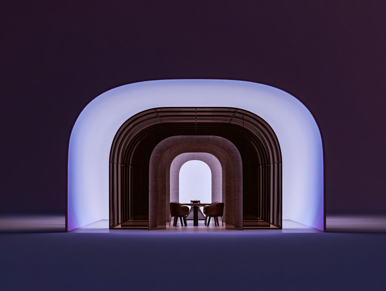
Exhibition Stage: The three-dimensional manifestation of the brand

Broadcast

24/05/2026

Author

Pantograph

Duration

7 min read

The Third Dimension

A brand's visual communication is mostly thought of in two dimensions: web, social media, printed material. The third dimension—how the brand positions itself in a space—is a less-discussed area, yet one of high cost and impact. The exhibition stand is the most concentrated application of this domain.

This article is on where the exhibition stand fits in the brand's visual system.

The Stage of Intensity

The exhibition operates differently from usual communication channels for export and B2B branding. Within a time frame of a few days, a high-intensity contact with the target audience takes place. A distributor, a buyer, an investor passes in front of the stand; they make a decision in three seconds, to stop or to keep walking.

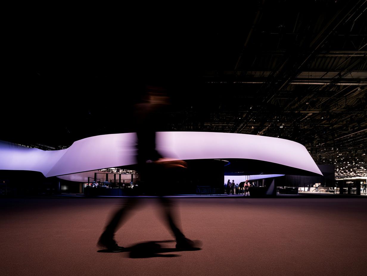
The mathematics of these three seconds is the core issue of the exhibition stand. What does the passerby look at? Not the logo; most of the time they cannot see it. Not the slogan; there is no time to read. They look at the general silhouette—the size, openness, light, dominant color, the object standing on the stand—this structural reading happens instantly. The decision resulting from this reading becomes the first link in the brand definition.

The person designing the stand must know the mathematics of these three seconds. Design decisions are made based on this intensity.

Three Layers, One Language

A good exhibition stand operates three layers simultaneously.

First layer: recognition from a distance. The person seeing the stand before even getting close—perhaps from twenty meters away—should understand what they are facing. The only things read from this distance are silhouette, light, and dominant color. Fine details are not yet readable; but it is understood that the brand has "its own territory."

Second layer: close-up draw. The person coming to the front of the stand (three-to-five meters) now receives more information: logo, headline-level text, exhibited product, visuals. At this distance, the decision is made—will they stop or pass by? If it does not look attractive, they will pass by.

Third layer: internal function. The person entering has now entered the conversation area both informationally and physically. The internal layout of the stand—meeting area, presentation corner, product display, resting spot—must carry these conversations.

If all three layers share the same design language, the stand feels cohesive. If one of the layers contradicts another, the stand looks disorganized.

Material: Where the Brand Touches

The exhibition stand is one of the rare points where the brand touches the customer's finger. The signboard is read from afar; the brochure is held in hand; the screen is watched from the front; the stand is walked into, touched, and sat in. This physicality highlights the tangible character of the brand.

Malzeme örnekleri — modern

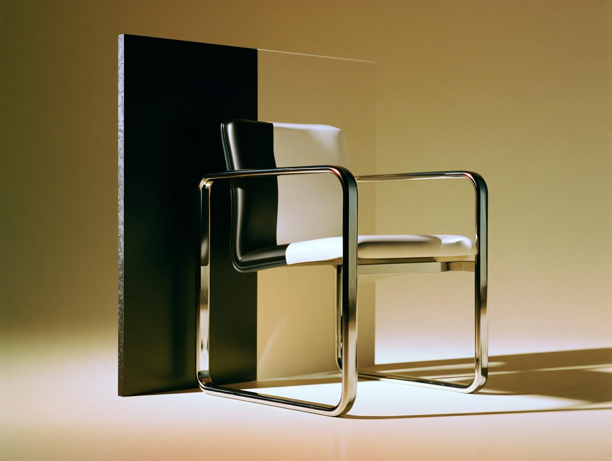
The choice of material carries this character. Raw metal, polished composite, wood, stone, fabric—every choice speaks of an aspect of the brand. A high-tech brand contradicts a raw surface; a brand with a handmade promise does not speak the same language as a glossy vinyl surface. What the material says leaves a more lasting impression than the slogan written upon it.

Lighting: The Unseen Discipline

How much light should be in which layer of the exhibition is a decision not focused on in most stands. Yet, lighting is one of the strongest visual disciplines of the exhibition.

Modern aydınlık kapı — görünmeyen disiplin

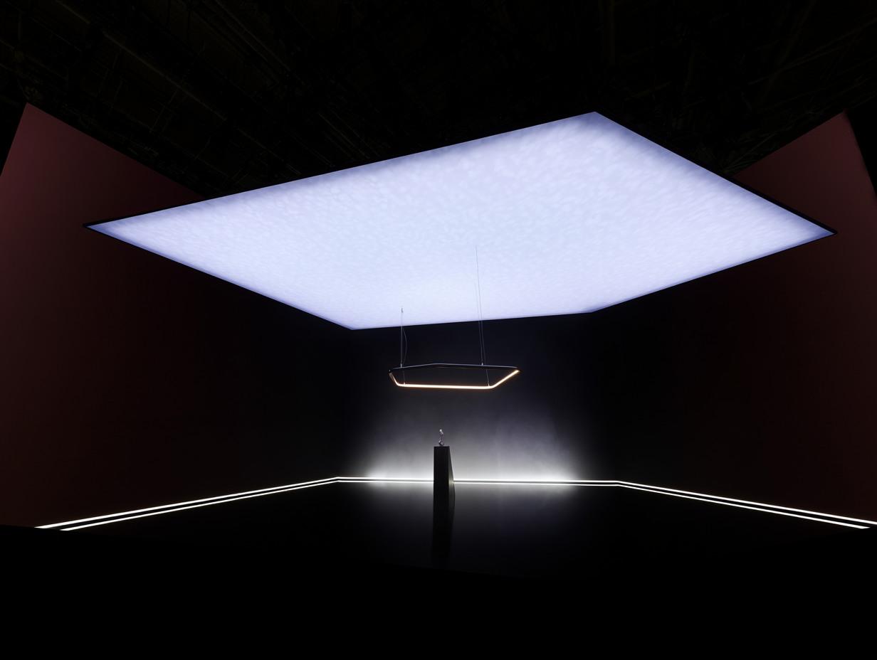
Right lighting highlights the stand inside the crowded exhibition hall. A flat-lit stand feels dull; an accent-lit stand looks vibrant. When the lighting plan—main light, accent lights, product spotlights, ambient light—is executed with the same meticulousness as the architectural plan, it doubles the stand's impact.

Inadequate lighting is not just a visual problem; it makes the stand feel tired, cold, and abandoned. The passerby does not voice this with words; but they do not approach it.

The Void of Sound

In most poorly executed exhibition stands, there is no sound. The stand is silent; surrounding noise penetrates everywhere; conversations become difficult; the environment feels exhausting. Good stands create an acoustic island within themselves.

This acoustic island is built with a few things: soft surfaces (carpeting, curtains, fabric screens), background music (soft, appropriate for the brand, a choice not dominated by heavy bass tones), guiding the sounds coming from screens (in a way that will not spill out of the area). Ultimately, the conversation carried out within the stand becomes possible despite the external noise.

Between Digital and Physical

Modern exhibition stands are no longer purely physical. Screens, interactive presentations, QR code-based information bridges, VR demos, AR product displays—digital layers have settled inside the physical stand.

When this placement is disciplined, it increases the impact of the stand; when undisciplined, it scatters it. A good digital layer complements the physical experience; a sub-par digital layer steals the visitor's attention to a screen instead of physical contact. Observation of this balance is the real mastery of the stand.

Afterwards: When the Conversation Ends

The exhibition lasts three days; the relationships behind it continue for months. When designing the stand, one must think about this aftermath as well. Every visitor coming out of the stand takes something to their notebook, memory, or email.

Modern broşür ve not — fuar sonrası

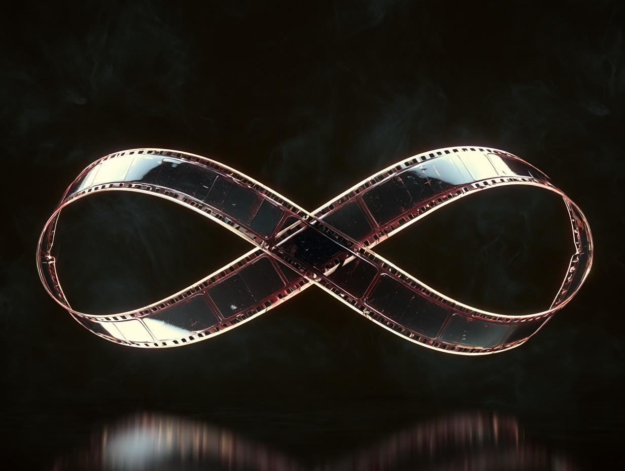
What is it they take away? A note with the brand, a brochure, a digital reference, a gift, a souvenir—when these small objects are seen on the desk months later, they remind of the brand again. Good stands address this extension as part of the design; they think about what every passing visitor takes away, how the object they take looks, and how they store it.

Conclusion

An exhibition stand is not an architectural project; it is a three-dimensional extension of the brand. Brand identity is designed in two dimensions, and staged and applied in three dimensions. Every choice made on this stage—material, light, sound, motion, digital layer—is the physical evidence of what the brand claims.

A good stand does not sell products—it ensures the brand is understood. Sales pitches come later; but the foundation of these pitches is established as the visitor steps onto the stand. If the foundation is solid, the conversation becomes easier. If the foundation is weak, even the best speaker cannot make a difference.

The Third Dimension

A brand's visual communication is mostly thought of in two dimensions: web, social media, printed material. The third dimension—how the brand positions itself in a space—is a less-discussed area, yet one of high cost and impact. The exhibition stand is the most concentrated application of this domain.

This article is on where the exhibition stand fits in the brand's visual system.

The Stage of Intensity

The exhibition operates differently from usual communication channels for export and B2B branding. Within a time frame of a few days, a high-intensity contact with the target audience takes place. A distributor, a buyer, an investor passes in front of the stand; they make a decision in three seconds, to stop or to keep walking.

The mathematics of these three seconds is the core issue of the exhibition stand. What does the passerby look at? Not the logo; most of the time they cannot see it. Not the slogan; there is no time to read. They look at the general silhouette—the size, openness, light, dominant color, the object standing on the stand—this structural reading happens instantly. The decision resulting from this reading becomes the first link in the brand definition.

The person designing the stand must know the mathematics of these three seconds. Design decisions are made based on this intensity.

Three Layers, One Language

A good exhibition stand operates three layers simultaneously.

First layer: recognition from a distance. The person seeing the stand before even getting close—perhaps from twenty meters away—should understand what they are facing. The only things read from this distance are silhouette, light, and dominant color. Fine details are not yet readable; but it is understood that the brand has "its own territory."

Second layer: close-up draw. The person coming to the front of the stand (three-to-five meters) now receives more information: logo, headline-level text, exhibited product, visuals. At this distance, the decision is made—will they stop or pass by? If it does not look attractive, they will pass by.

Third layer: internal function. The person entering has now entered the conversation area both informationally and physically. The internal layout of the stand—meeting area, presentation corner, product display, resting spot—must carry these conversations.

If all three layers share the same design language, the stand feels cohesive. If one of the layers contradicts another, the stand looks disorganized.

Material: Where the Brand Touches

The exhibition stand is one of the rare points where the brand touches the customer's finger. The signboard is read from afar; the brochure is held in hand; the screen is watched from the front; the stand is walked into, touched, and sat in. This physicality highlights the tangible character of the brand.

Malzeme örnekleri — modern

The choice of material carries this character. Raw metal, polished composite, wood, stone, fabric—every choice speaks of an aspect of the brand. A high-tech brand contradicts a raw surface; a brand with a handmade promise does not speak the same language as a glossy vinyl surface. What the material says leaves a more lasting impression than the slogan written upon it.

Lighting: The Unseen Discipline

How much light should be in which layer of the exhibition is a decision not focused on in most stands. Yet, lighting is one of the strongest visual disciplines of the exhibition.

Modern aydınlık kapı — görünmeyen disiplin

Right lighting highlights the stand inside the crowded exhibition hall. A flat-lit stand feels dull; an accent-lit stand looks vibrant. When the lighting plan—main light, accent lights, product spotlights, ambient light—is executed with the same meticulousness as the architectural plan, it doubles the stand's impact.

Inadequate lighting is not just a visual problem; it makes the stand feel tired, cold, and abandoned. The passerby does not voice this with words; but they do not approach it.

The Void of Sound

In most poorly executed exhibition stands, there is no sound. The stand is silent; surrounding noise penetrates everywhere; conversations become difficult; the environment feels exhausting. Good stands create an acoustic island within themselves.

This acoustic island is built with a few things: soft surfaces (carpeting, curtains, fabric screens), background music (soft, appropriate for the brand, a choice not dominated by heavy bass tones), guiding the sounds coming from screens (in a way that will not spill out of the area). Ultimately, the conversation carried out within the stand becomes possible despite the external noise.

Between Digital and Physical

Modern exhibition stands are no longer purely physical. Screens, interactive presentations, QR code-based information bridges, VR demos, AR product displays—digital layers have settled inside the physical stand.

When this placement is disciplined, it increases the impact of the stand; when undisciplined, it scatters it. A good digital layer complements the physical experience; a sub-par digital layer steals the visitor's attention to a screen instead of physical contact. Observation of this balance is the real mastery of the stand.

Afterwards: When the Conversation Ends

The exhibition lasts three days; the relationships behind it continue for months. When designing the stand, one must think about this aftermath as well. Every visitor coming out of the stand takes something to their notebook, memory, or email.

Modern broşür ve not — fuar sonrası

What is it they take away? A note with the brand, a brochure, a digital reference, a gift, a souvenir—when these small objects are seen on the desk months later, they remind of the brand again. Good stands address this extension as part of the design; they think about what every passing visitor takes away, how the object they take looks, and how they store it.

Conclusion

An exhibition stand is not an architectural project; it is a three-dimensional extension of the brand. Brand identity is designed in two dimensions, and staged and applied in three dimensions. Every choice made on this stage—material, light, sound, motion, digital layer—is the physical evidence of what the brand claims.

A good stand does not sell products—it ensures the brand is understood. Sales pitches come later; but the foundation of these pitches is established as the visitor steps onto the stand. If the foundation is solid, the conversation becomes easier. If the foundation is weak, even the best speaker cannot make a difference.

To discover what we can achieve together;

©2026 Pentograf — All rights reserved.

To discover what we can achieve together;

©2026 Pentograf — All rights reserved.

To discover what we can achieve together;

©2026 Pentograf — All rights reserved.