
The Surface of the System: A note on corporate identity
Beneath the surface: the mechanics of the system

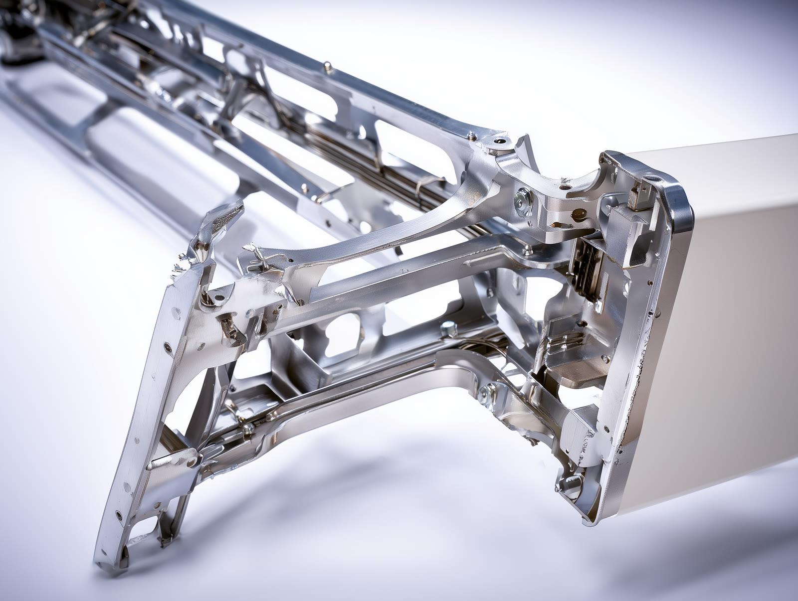
The logo is the visible surface of an identity — like the dial of a watch. The gears that carry it are typography, grid, colour and tone of voice. The simpler the surface looks, the better the system beneath it has been built.
In identity projects the real labour goes into this invisible chassis: which heading at which size, where the spacing tightens, which tone a colour takes on which ground. If those decisions have not been made, the logo alone can carry no weight.
Layers: colour, typography, tone of voice
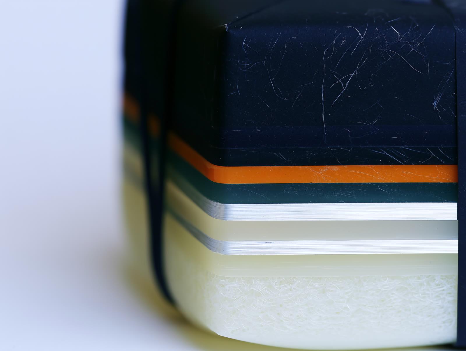
Identity is not a single decision but the sum of overlapping layers. Each layer is ordinary on its own: a typeface, a colour, a way of speaking. The signature is born when these layers always come together in the same order and the same proportion.
Cut a cross-section through a solid identity and the hierarchy shows: what leads and what stays in the background is clear. If the order of layers changes with every job, what you have is not a system but coincidence.
Consistency: the guidelines carry the system


Guidelines are not a decorative document but a production tool. The team that built the identity will one day move on; the guidelines remain. What produces the same result on the thousandth repetition out of a thousand is the set of rules inside that book.
A well-built system works like identical products on a production line: whichever medium, whoever produces it, it yields the same brand. Even the accent meant to stand out is chosen from within the system — like the single sharp product on the line.
More articles
All articles →Previous article
Pen-to-graf: Where does our name come from?
Pentograf, not pantograph. The name has two parts: pen and graf — from pen to graphic, from idea to form.
October 2026
Next article
Producing the Visible: On brand visual production
Brand identity is designed; it lives through visual production. An analysis of brand photography, promo film, product shoots and the social media visual system.
May 2026