Production of the Visible: On brand visual production
Broadcast
14.05.2026
Author
Pantograph
Duration
7 min read

Identity and Production
In the previous article, we emphasized that corporate identity is not a visual, but a system. A system is established, rules are written, and the manual is delivered. But work does not end once the identity is established; on the contrary, another endless job begins: the work of visual production that will keep that identity alive day by day.
A brand is designed, but it lives daily through visual production. The homepage graphic of the website, a social media post, a product shoot, an exhibition photo, a corporate video, a promotional film - all of these are the daily manifestations of the brand identity. Identity does not exist independently of this production; and production does not gain meaning independently of the identity. The two are extensions of each other.
The problem is this: in most companies, these two sides run as two separate processes thought of apart from each other. Identity is a one-time project; visual production is a daily item within the supply chain. The issue we called asymmetry in the first article re-emerges here in another form.
A Short History of Stock Imagery
There is a common habit in visual production in Turkey, and generally everywhere in the world: the use of stock imagery. Fast, cheap, and usually looks good enough. The hero image of a website, the cover of a blog post, the background of a LinkedIn post, the landing page of a corporate presentation - all can be selected from a stock imagery library.

The practical logic of stock imagery is indisputable; but its strategic cost often remains an unexamined item.
A brand using a stock image means that hundreds of other brands are using that same image at the same time. You can find the exact same photo you see in a Turkish exporter's catalog in a competitor in India, a distributor in Poland, or an e-commerce site in Brazil. Stock imagery makes the brand invisible while appearing; because it does not belong to it, is not unique to it, and does not represent it. It merely takes its place.
The most expensive thing for a brand is to exist but go unnoticed. Stock imagery produces exactly this.
Brand Photography: Linking the Visual to Identity
Brand photography is the opposite of the stock mentality. It is the creation of a brand's unique visual universe. It is shooting the same product differently from how a competitor brand shoots it, or showing it differently from how another company in the same industry shows it.
The discipline of brand photography works on several axes at once. The choice of light (warm or cold; natural or studio) carries the brand's character. The color palette (retouching and color grading) must align with the corporate identity's color system. Composition rules (wide or close-up; centered or asymmetric) must be consistent. Model and environment management must reflect the audience the brand addresses. Each of these is a decision on its own; together, they make a visual signature.
A brand having its own visual universe evokes the feeling "there is a character here" in anyone looking at the brand. It must be said that this feeling is not formed by looking at a single photo; when hundreds of photos of a brand speak the same language over the years, the visual signature emerges. This signature is the daily reaffirmation of identity.
Promotional Video: Rhythm Before Duration
The promotional video is one of the forms of visual production in which modern brands invest most heavily. Its duration is short but its ambition is big: to explain what a brand does, why it is there, and what promise it stands by in 30-60 seconds.

A good promotional video is not a matter of duration; it is a matter of rhythm. The first three seconds - the hook - determine whether the viewer will stop or not. If the hook does not work, the rest of the video will not be watched. The next ten to fifteen seconds establish the ground for the subject; the next twenty seconds develop the argument; the last few seconds secure the closing and contact with the brand. This structure is not a mold; it is a spine. Each video builds its own character upon this spine.
Another critical element of promotional video is sound design. No matter how good the visual quality is, a video with poor sound design feels amateur. The choice of music, the placement of sound effects, and the tone of the voice-over, if there is one - if all of these are not handled with the same meticulousness as the visual, the video falls short of its own potential impact.
Rhythm before duration, sound before visuals, hook before storytelling. These are the invisible disciplines of the promotional video.
Product and Lifestyle Shoots: Two Different Jobs
Product shoots and lifestyle shoots are often thought of as the same process; however, they are two separate disciplines serving different purposes.
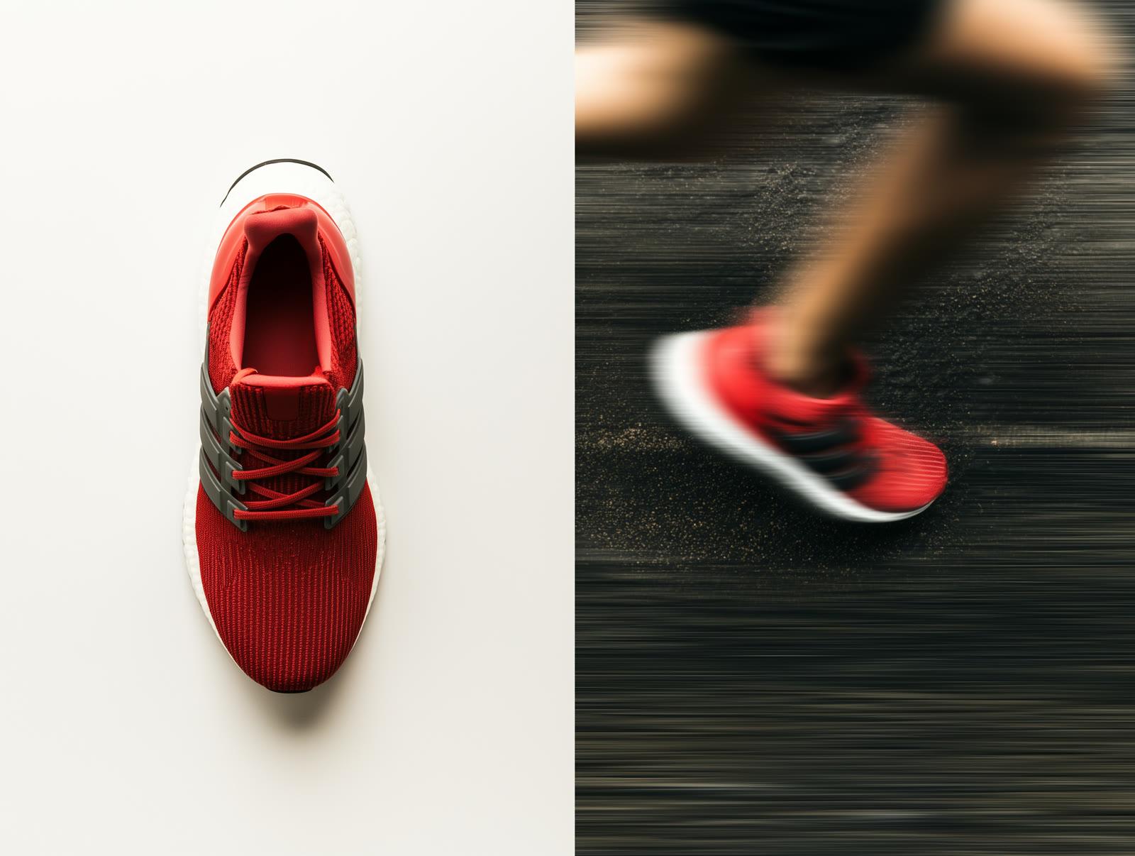
A product shoot shows the product itself. It documents its details, material, form, and quality. It is shot against a white background, with controlled lighting, and absolute sharpness. It is the foundation of e-commerce pages, catalogs, and technical documentation. The job of the product shoot is to answer the buyer's question: "What exactly is this product?"
A lifestyle shoot, on the other hand, shows the promise of the product. It tells how the product enters into life, who uses it, in what environment it takes place, and what emotion it evokes. It is shot in context, often with a model, in a composition with a story. It is the lifeblood of advertising campaigns, brand catalogs, and social media content. The job of the lifestyle shoot is to answer the buyer's question: "What will this product do in my life?"
The two are not interchangeable. Using a product shoot in place of a lifestyle shoot makes selling the product harder; using a lifestyle shoot in place of a product shoot prevents the product from being understood. A brand must know which type of shoot is right at which touchpoint; it must have a decision logic that distinguishes between the two.
Visual System on Social Media
Social media visual production is treated as a daily production problem in most companies: what will we share today, what will we share tomorrow. This approach seems sufficient in the short term, but scatters the brand in the long term.

Good social media visual production is not about designing daily posts, but about establishing a visual system. When the system is established, each new post is not designed from scratch; it is applied within the system. Templates, grid systems, font hierarchies, color usage rules, photography-illustration-typography balance - when all are predefined, daily production both speeds up and strengthens the brand's visual identity.
This is not a matter of "Canva habits"; it is a matter of design discipline. The word template is understood as restricting creativity, but it does quite the opposite: it focuses creativity in the right place. Instead of thinking about where to place the logo on every post, the designer thinks about what the actual message is. The system takes care of the repetitive part of the work, opening up breathing space for creativity.
Brands with a consistent visual system build a visual memory over time. Customers start to understand who shared the post even before seeing the logo. This memory is the long-term return on social media investment; but it is only obtained when the system is established.
Production is the Proof of Identity
All these disciplines - brand photography, promotional videos, product and lifestyle shoots, visual systems on social media - unite around a single issue: visually proving a brand's claims.
Whatever a brand says, its visual production must say it too. A brand claiming quality must show quality in its photos. A brand claiming modernity must be modern through its video language. A brand claiming sustainability must make this felt in its visual universe. The inconsistency between the claim and the visual tells the customer that the claim is not serious.
Visual production is a brand's daily work of keeping its own word. The word is spoken in design; it is reaffirmed every day in visual production.
Conclusion
A brand's identity is designed, but it lives through visual production. When the connection between the two is broken, the identity remains on paper; when it is tightly established, it rejuvenates itself at every touchpoint.
If you have a brand and want to turn it into an entity with its own voice over the years, there are two questions to ask: First, what is this brand's visual universe? Second, with what discipline and what continuity will we be producing this universe?
If the answers to both are clear, the brand's visual life establishes itself. If not, no matter what investment is made, the resulting production cannot be the brand itself - it only becomes something else taking its place.
Identity and Production
In the previous article, we emphasized that corporate identity is not a visual, but a system. A system is established, rules are written, and the manual is delivered. But work does not end once the identity is established; on the contrary, another endless job begins: the work of visual production that will keep that identity alive day by day.
A brand is designed, but it lives daily through visual production. The homepage graphic of the website, a social media post, a product shoot, an exhibition photo, a corporate video, a promotional film - all of these are the daily manifestations of the brand identity. Identity does not exist independently of this production; and production does not gain meaning independently of the identity. The two are extensions of each other.
The problem is this: in most companies, these two sides run as two separate processes thought of apart from each other. Identity is a one-time project; visual production is a daily item within the supply chain. The issue we called asymmetry in the first article re-emerges here in another form.
A Short History of Stock Imagery
There is a common habit in visual production in Turkey, and generally everywhere in the world: the use of stock imagery. Fast, cheap, and usually looks good enough. The hero image of a website, the cover of a blog post, the background of a LinkedIn post, the landing page of a corporate presentation - all can be selected from a stock imagery library.

The practical logic of stock imagery is indisputable; but its strategic cost often remains an unexamined item.
A brand using a stock image means that hundreds of other brands are using that same image at the same time. You can find the exact same photo you see in a Turkish exporter's catalog in a competitor in India, a distributor in Poland, or an e-commerce site in Brazil. Stock imagery makes the brand invisible while appearing; because it does not belong to it, is not unique to it, and does not represent it. It merely takes its place.
The most expensive thing for a brand is to exist but go unnoticed. Stock imagery produces exactly this.
Brand Photography: Linking the Visual to Identity
Brand photography is the opposite of the stock mentality. It is the creation of a brand's unique visual universe. It is shooting the same product differently from how a competitor brand shoots it, or showing it differently from how another company in the same industry shows it.
The discipline of brand photography works on several axes at once. The choice of light (warm or cold; natural or studio) carries the brand's character. The color palette (retouching and color grading) must align with the corporate identity's color system. Composition rules (wide or close-up; centered or asymmetric) must be consistent. Model and environment management must reflect the audience the brand addresses. Each of these is a decision on its own; together, they make a visual signature.
A brand having its own visual universe evokes the feeling "there is a character here" in anyone looking at the brand. It must be said that this feeling is not formed by looking at a single photo; when hundreds of photos of a brand speak the same language over the years, the visual signature emerges. This signature is the daily reaffirmation of identity.
Promotional Video: Rhythm Before Duration
The promotional video is one of the forms of visual production in which modern brands invest most heavily. Its duration is short but its ambition is big: to explain what a brand does, why it is there, and what promise it stands by in 30-60 seconds.

A good promotional video is not a matter of duration; it is a matter of rhythm. The first three seconds - the hook - determine whether the viewer will stop or not. If the hook does not work, the rest of the video will not be watched. The next ten to fifteen seconds establish the ground for the subject; the next twenty seconds develop the argument; the last few seconds secure the closing and contact with the brand. This structure is not a mold; it is a spine. Each video builds its own character upon this spine.
Another critical element of promotional video is sound design. No matter how good the visual quality is, a video with poor sound design feels amateur. The choice of music, the placement of sound effects, and the tone of the voice-over, if there is one - if all of these are not handled with the same meticulousness as the visual, the video falls short of its own potential impact.
Rhythm before duration, sound before visuals, hook before storytelling. These are the invisible disciplines of the promotional video.
Product and Lifestyle Shoots: Two Different Jobs
Product shoots and lifestyle shoots are often thought of as the same process; however, they are two separate disciplines serving different purposes.
A product shoot shows the product itself. It documents its details, material, form, and quality. It is shot against a white background, with controlled lighting, and absolute sharpness. It is the foundation of e-commerce pages, catalogs, and technical documentation. The job of the product shoot is to answer the buyer's question: "What exactly is this product?"
A lifestyle shoot, on the other hand, shows the promise of the product. It tells how the product enters into life, who uses it, in what environment it takes place, and what emotion it evokes. It is shot in context, often with a model, in a composition with a story. It is the lifeblood of advertising campaigns, brand catalogs, and social media content. The job of the lifestyle shoot is to answer the buyer's question: "What will this product do in my life?"
The two are not interchangeable. Using a product shoot in place of a lifestyle shoot makes selling the product harder; using a lifestyle shoot in place of a product shoot prevents the product from being understood. A brand must know which type of shoot is right at which touchpoint; it must have a decision logic that distinguishes between the two.
Visual System on Social Media
Social media visual production is treated as a daily production problem in most companies: what will we share today, what will we share tomorrow. This approach seems sufficient in the short term, but scatters the brand in the long term.

Good social media visual production is not about designing daily posts, but about establishing a visual system. When the system is established, each new post is not designed from scratch; it is applied within the system. Templates, grid systems, font hierarchies, color usage rules, photography-illustration-typography balance - when all are predefined, daily production both speeds up and strengthens the brand's visual identity.
This is not a matter of "Canva habits"; it is a matter of design discipline. The word template is understood as restricting creativity, but it does quite the opposite: it focuses creativity in the right place. Instead of thinking about where to place the logo on every post, the designer thinks about what the actual message is. The system takes care of the repetitive part of the work, opening up breathing space for creativity.
Brands with a consistent visual system build a visual memory over time. Customers start to understand who shared the post even before seeing the logo. This memory is the long-term return on social media investment; but it is only obtained when the system is established.
Production is the Proof of Identity
All these disciplines - brand photography, promotional videos, product and lifestyle shoots, visual systems on social media - unite around a single issue: visually proving a brand's claims.
Whatever a brand says, its visual production must say it too. A brand claiming quality must show quality in its photos. A brand claiming modernity must be modern through its video language. A brand claiming sustainability must make this felt in its visual universe. The inconsistency between the claim and the visual tells the customer that the claim is not serious.
Visual production is a brand's daily work of keeping its own word. The word is spoken in design; it is reaffirmed every day in visual production.
Conclusion
A brand's identity is designed, but it lives through visual production. When the connection between the two is broken, the identity remains on paper; when it is tightly established, it rejuvenates itself at every touchpoint.
If you have a brand and want to turn it into an entity with its own voice over the years, there are two questions to ask: First, what is this brand's visual universe? Second, with what discipline and what continuity will we be producing this universe?
If the answers to both are clear, the brand's visual life establishes itself. If not, no matter what investment is made, the resulting production cannot be the brand itself - it only becomes something else taking its place.