Why Blue Wins: on the universality and ownership of color
On the universality and ownership of color
On February 26, 2015, a photograph of a dress taken by a wedding guest in Scotland landed on the internet and within a few hours split the world in two: was the dress blue and black, or white and gold? Same photograph, same pixels. Four months later, Rosa Lafer-Sousa, Katherine Hermann, and Bevil Conway of MIT published the results from a sample of 1,401 people in Current Biology: 57 percent saw blue and black, 30 percent white and gold, 11 percent blue and brown, and the difference could not be explained by color vision deficiency. The light in the photograph was ambiguous; the brain was correcting the colors according to the silent answer it gave to the question "is this dress in shadow, or under warm light?" The dress showed everyone what science had long known about color: color is not in the object, it is in the brain. This is why a brand's claim to have "its own color" is a more technical matter than it seems.
1. The eye before language: Berlin and Kay's eleven colors
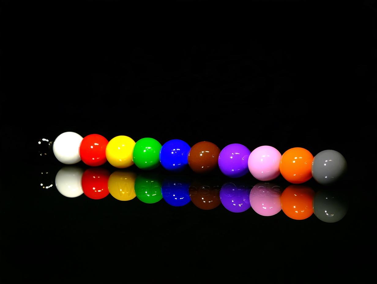
In 1969, the anthropologist Brent Berlin and the linguist Paul Kay compared basic color terms across 98 languages and found an unexpected order. Languages differed in how many color words they had, but the sequence was almost universal: languages with two terms had black and white; the third term was always red; then came green or yellow, then blue, then brown; purple, pink, orange, and gray appeared last. Blue was a color that human languages named late; it is no surprise that Homer described the sea as "wine-dark."
Having no name for a color does not mean not seeing it, but it does affect discrimination. In 2005, Roberson, Davidoff, Davies, and Shapiro worked with the Himba people of Namibia; in the Himba language, blue and part of green fall into the same category, and when participants told two colors apart they sped up and slowed down according to the boundaries of their own categories. Color is constructed where physics meets culture: wavelength is universal, category is learned. A "lacivert" chosen for the Turkish market and a "dunkelblau" chosen for the German market may not carry the same meaning even when they are the same value.
2. Why blue wins
In 2007, Anya Hurlbert and Yazhu Ling measured color preference among British and Chinese participants in Current Biology. In both cultures the most liked region was blue; the only systematic difference between the sexes was that women leaned more toward the red-purple axis than men did. When the advantage of blue turned out to be independent of culture, the researchers proposed an evolutionary explanation: clear skies and clean water, blue's association throughout history with a safe environment.
The marketing literature translated this into the language of brands. In 2012, Lauren Labrecque and George Milne measured the matches between color and brand personality in the Journal of the Academy of Marketing Science: blue was significantly associated with "competence," red with "excitement," and brown with "ruggedness." The blueness of banks, technology companies, and insurers is no coincidence; it is the self-fulfilling result of this match. The reason for Facebook's blue, on the other hand, is physiological: Mark Zuckerberg is red-green color-blind and, by his own account, blue is the color he sees best. In 2009, Google chose the link blue in its search results by testing 41 different shades; Dan Cobley, the company's UK managing director, disclosed in 2014 that this single decision brought in roughly $200 million a year in additional advertising revenue.
3. The price of red
Red is the color whose measurable effect on human behavior is the best documented, and its effect reverses with context. In 2005, Russell Hill and Robert Barton showed in Nature that in the boxing, taekwondo, and wrestling contests of the 2004 Athens Olympics, athletes wearing red won significantly more often against evenly matched opponents. Two years later, in the Journal of Experimental Psychology: General, Andrew Elliot and colleagues measured the other face of the same color: students who saw a red number in the corner of their exam paper scored lower than those who saw green or black. Red provoked dominance when aimed at an opponent and avoidance when aimed at oneself.
In 2009, Ravi Mehta and Rui Zhu completed the picture in Science with a screen-background experiment: a red background improved performance on detail and error-detection tasks, a blue background on creative tasks. This is why a color decision is made not with the question "which color is beautiful" but with the question "what will the customer do on this screen": on a discount tag, red gathers attention; on the cover of a consulting proposal, the same red produces unease.
4. The world's most repellent color
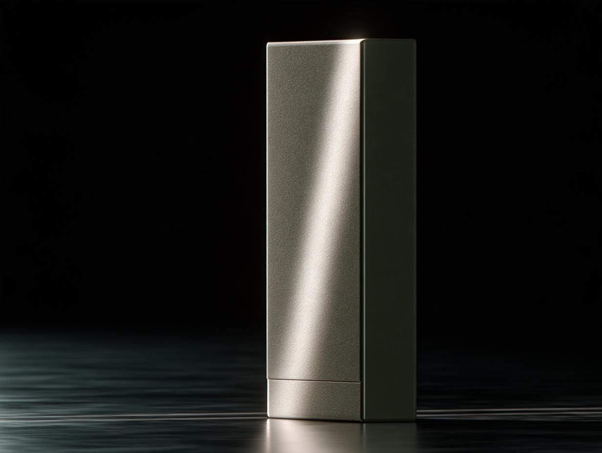
In 2012, as the Australian government removed brands from cigarette packs, it asked a question: what color should the pack be? The research firm GfK ran seven studies with a thousand smokers; the aim was to find the least attractive color. The winner was Pantone 448C, a brownish dark olive green; participants matched it with "death," "tar," and "dirt." From December 2012, every pack in Australia was painted this color; the United Kingdom, France, and Ireland followed. Pantone objected to the color being called "the ugliest": in fashion and interiors, the same shade could read as "earthy" and "natural."
What the episode tells design is that a color carries no emotion on its own; it carries one together with its context. This is why lists of universal color meanings of the "green means nature" kind are useless; the same green produces trust on an organic food brand and disgust on a cigarette pack. A color decision is made together with the surface the color will sit on, the material it will sit beside, and the expectation it will stand against.
5. The brain corrects for light: color constancy
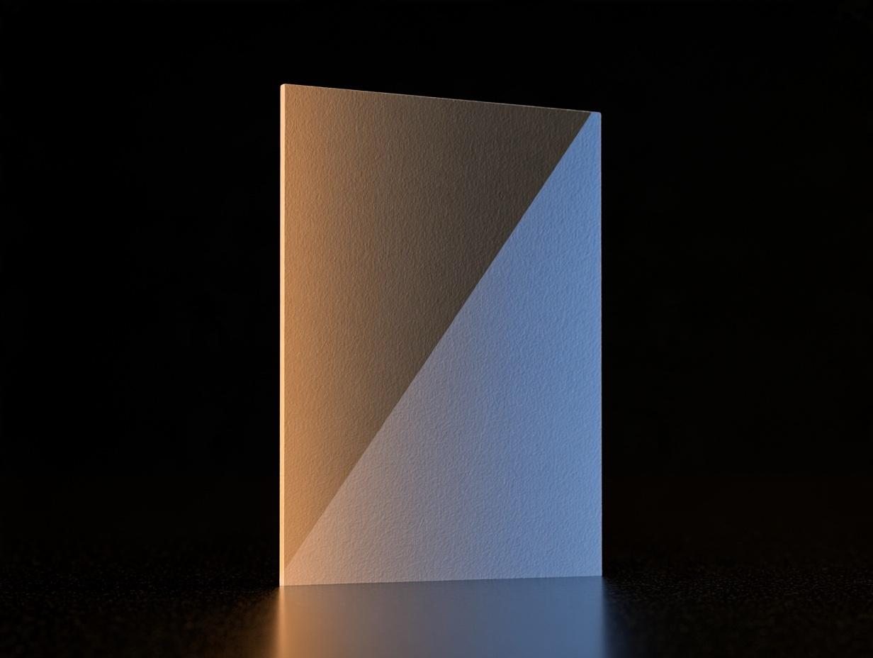
The mechanism behind the dress is called color constancy. In the Mondrian experiments he published in Scientific American in 1977, Edwin Land lit colored paper surfaces in such a way that the physical light reaching the eye was exactly the same for two different papers; participants nonetheless saw one as green and the other as red. The brain was estimating the color of the light falling on the surface, subtracting it, and computing the "true" surface color. Land called this the retinex theory. The dress was a rare case in which that computation had two valid answers.
The same mechanism appears in print as metamerism: two color samples look the same under store lighting and different in daylight, because the wavelength distributions they reflect are different and the brain makes two different corrections under the two lights. This is why defining a brand color by its screen value alone is insufficient; a separate reference is given for the paper type, the ink, and the light it will be viewed under.
6. Owning a color
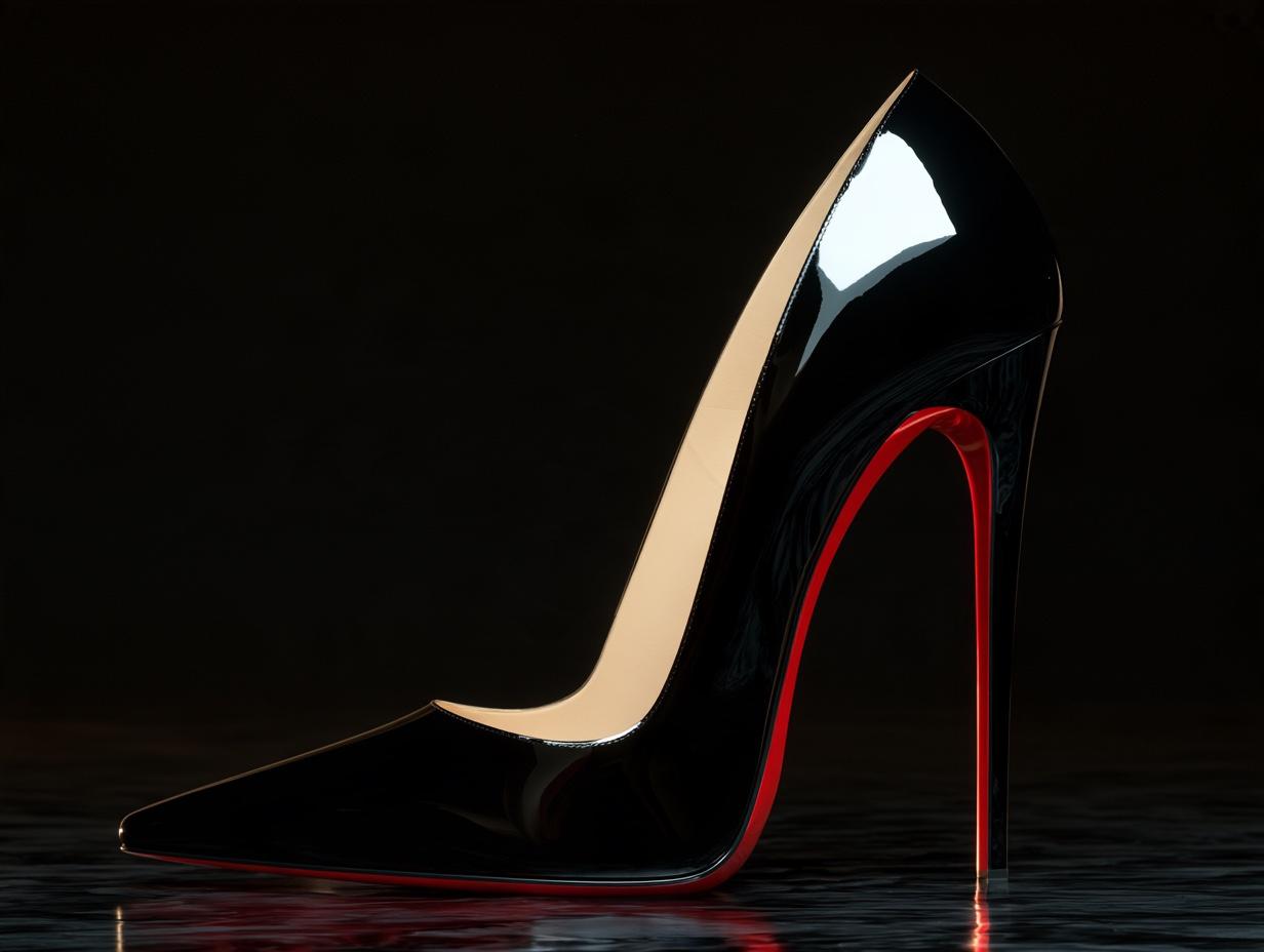
In 2008, Christian Louboutin registered the red sole of his shoes in the United States; in 2012, the federal appeals court in New York ruled that the registration was valid only for "a red sole that contrasts with the upper," and the Court of Justice of the European Union protected the mark in 2018. Tiffany's blue is registered at Pantone under a special number: 1837, the year the company was founded. Deutsche Telekom's magenta, Owens-Corning's fiberglass pink (the first single color registered in the United States, in 1987), UPS's brown; all rest on the same principle: a color is protected if it is deemed to have "acquired distinctiveness" through long and consistent use. The reason Cadbury lost its purple to Nestlé in England's Court of Appeal in 2013 was not the color itself but that the phrase "predominant color" was found legally unclear.
The courts' question is the same as the designer's: does this color belong to this brand alone? What determines the answer is not the choice but the discipline. The tolerance, the paper reference, and the usage rule in the color guidelines are the evidence file for a lawsuit that may one day be filed.
7. Turning color into numbers
Whether a color is "the same" has been measured since 1976: the International Commission on Illumination's CIE L*a*b* space reduces the difference between two colors to a single number called ΔE; the CIEDE2000 formula, updated in 2001, is closer to the sensitivity of the human eye. The threshold in practice is two: a difference below ΔE 2 cannot be told apart unless the samples are placed side by side, and a print proof is accepted against this threshold. The Pantone system was born in 1963 when Lawrence Herbert standardized color mixing at a print shop; the Oklab space Björn Ottosson published in 2020, meanwhile, brought perceptual uniformity to digital design: in the OKLCH notation in CSS, two colors with the same lightness value also appear equally light to the eye, so a brand's family of tones can be derived mathematically.
The last number belongs to accessibility. About eight percent of men of Northern European descent, and half a percent of women, have difficulty telling red from green; the WCAG standard requires a contrast of at least 4.5:1 between text and background. A brand color that does not meet this ratio cannot serve as a text color in an interface; this is why a palette is delivered not as a single color but with a tested text color beside each primary color.
8. The color protocol in the studio
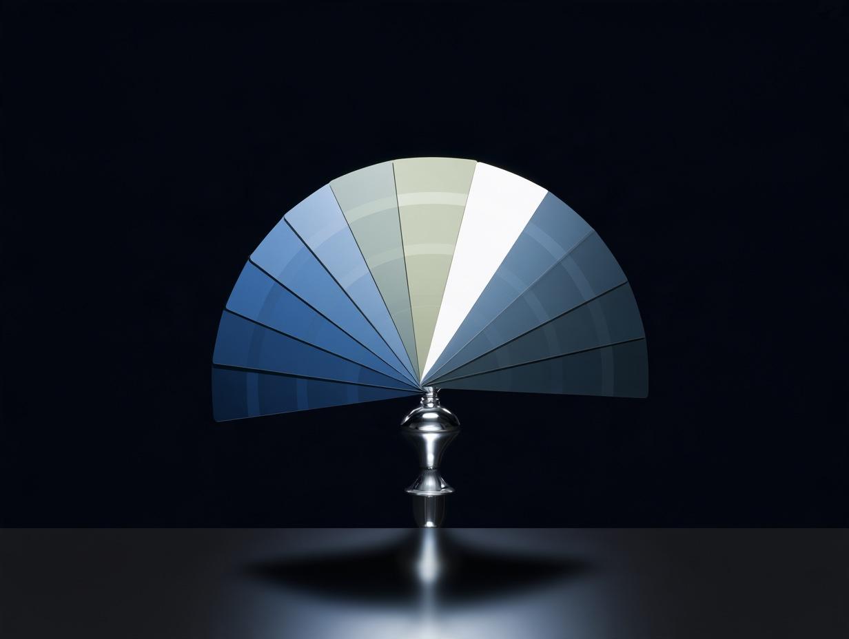
This literature left us a four-step protocol. First, context: the color is tested against the brand's promise using Labrecque and Milne's matches; a brand that promises "competence" is not given a color of excitement. Then, light: the candidate color is accepted after being viewed under three different lights, with Pantone C/U references on coated and uncoated paper and with sRGB and OKLCH values on screen; this is where metamerism is caught. Then, access: for each primary color, a text color that meets the 4.5:1 ratio, and a color-blindness simulation. Finally, ownership: whether anyone in the same sector is using the same color; the registration records are searched.
The dress divided 1,401 people because the light was ambiguous. A brand's color should have nothing left to divide; for that, the color is defined not as an emotion but as a range of numbers with the lighting condition specified.
References
Lafer-Sousa, R., Hermann, K. L. & Conway, B. R. (2015). Striking individual differences in color perception uncovered by "the dress" photograph. Current Biology, 25(13), R545–R546.
Berlin, B. & Kay, P. (1969). Basic Color Terms: Their Universality and Evolution. University of California Press.
Roberson, D., Davidoff, J., Davies, I. R. L. & Shapiro, L. R. (2005). Color categories: Evidence for the cultural relativity hypothesis. Cognitive Psychology, 50(4), 378–411.
Hurlbert, A. C. & Ling, Y. (2007). Biological components of sex differences in color preference. Current Biology, 17(16), R623–R625.
Labrecque, L. I. & Milne, G. R. (2012). Exciting red and competent blue: The importance of color in marketing. Journal of the Academy of Marketing Science, 40(5), 711–727.
Hill, R. A. & Barton, R. A. (2005). Red enhances human performance in contests. Nature, 435, 293.
Elliot, A. J., Maier, M. A., Moller, A. C., Friedman, R. & Meinhardt, J. (2007). Color and psychological functioning: The effect of red on performance attainment. Journal of Experimental Psychology: General, 136(1), 154–168.
Mehta, R. & Zhu, R. (2009). Blue or red? Exploring the effect of color on cognitive task performances. Science, 323(5918), 1226–1229.
Land, E. H. (1977). The retinex theory of color vision. Scientific American, 237(6), 108–128.
Ottosson, B. (2020). A perceptual color space for image processing (Oklab); CSS Color Module Level 4, oklch().
Case and legal records: GfK plain packaging research (Australia, 2012); Google's "41 blues" (2009) and Dan Cobley's statement (2014); Christian Louboutin v. Yves Saint Laurent, 2d Cir. (2012) and CJEU C-163/16 (2018); Société des Produits Nestlé v. Cadbury, EWCA Civ 1174 (2013); Owens-Corning color registration (1987); Pantone system (1963); CIE L*a*b* (1976) and CIEDE2000 (2001); WCAG 2.x contrast criterion.
More articles
All articles →Previous article
One Hundred Milliseconds: on the perception of motion and waiting
From IBM's 400 ms threshold of 1982 to the invisible gorilla: how the brain handles motion and delay, Disney's twelve principles, and animated logos, measured.
October 2026
Next article
Can a Font Lie: experiments on the persuasive power of typography
From Errol Morris's 45,000-reader Baskerville test to highway signs: how typefaces shift belief, reading speed, and memory; the serif myth and the Turkish dot.
October 2026