One Hundred Milliseconds: on the perception of motion and waiting
On the perception of motion and waiting
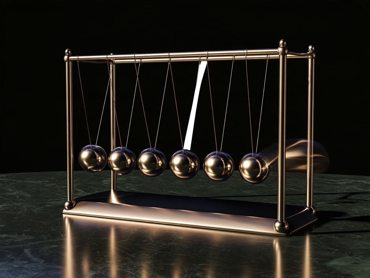
In 1982, the IBM researchers Walter Doherty and Ahrvind Thadani published a finding in the company's systems journal and overturned an assumption of the computing world. Until then, a computer answering a command within two seconds had been considered good enough. Doherty and Thadani measured that when response time dropped below 400 milliseconds, users' productivity jumped disproportionately: when the machine kept pace with the user's thinking, the user did not interrupt the thought and did not have to hold the next step in mind. This figure, which came to be called the "Doherty threshold," is today also the answer to how many milliseconds a button should take to respond when it is pressed. Motion design lives on either side of this threshold: too slow and it becomes waiting, too fast and it becomes invisible.
1. Three limits: 100 milliseconds, 1 second, 10 seconds
In 1968, Robert Miller set out the time limits of a person's conversation with a system; Stuart Card, George Robertson, and Jock Mackinlay confirmed those limits experimentally in 1991; Jakob Nielsen reduced them to three numbers in 1993. A response under a hundred milliseconds is perceived as "instant"; the brain fuses cause and effect into a single event. A delay of up to one second is noticed, but the flow of thought does not break. After ten seconds, attention drifts and the user moves on to something else.
These three numbers also set the budget of display technology. On a screen showing 60 frames per second there are 16.7 milliseconds for each frame; on 120-hertz screens, 8.3 milliseconds. When an animation exceeds this budget and drops frames, the eye calls it "stutter" and judges the product cheap. The motion designer's first rule is not aesthetics but arithmetic: how many milliseconds are there, and how many frames can be drawn in that time.
2. Cinema is not an optical illusion
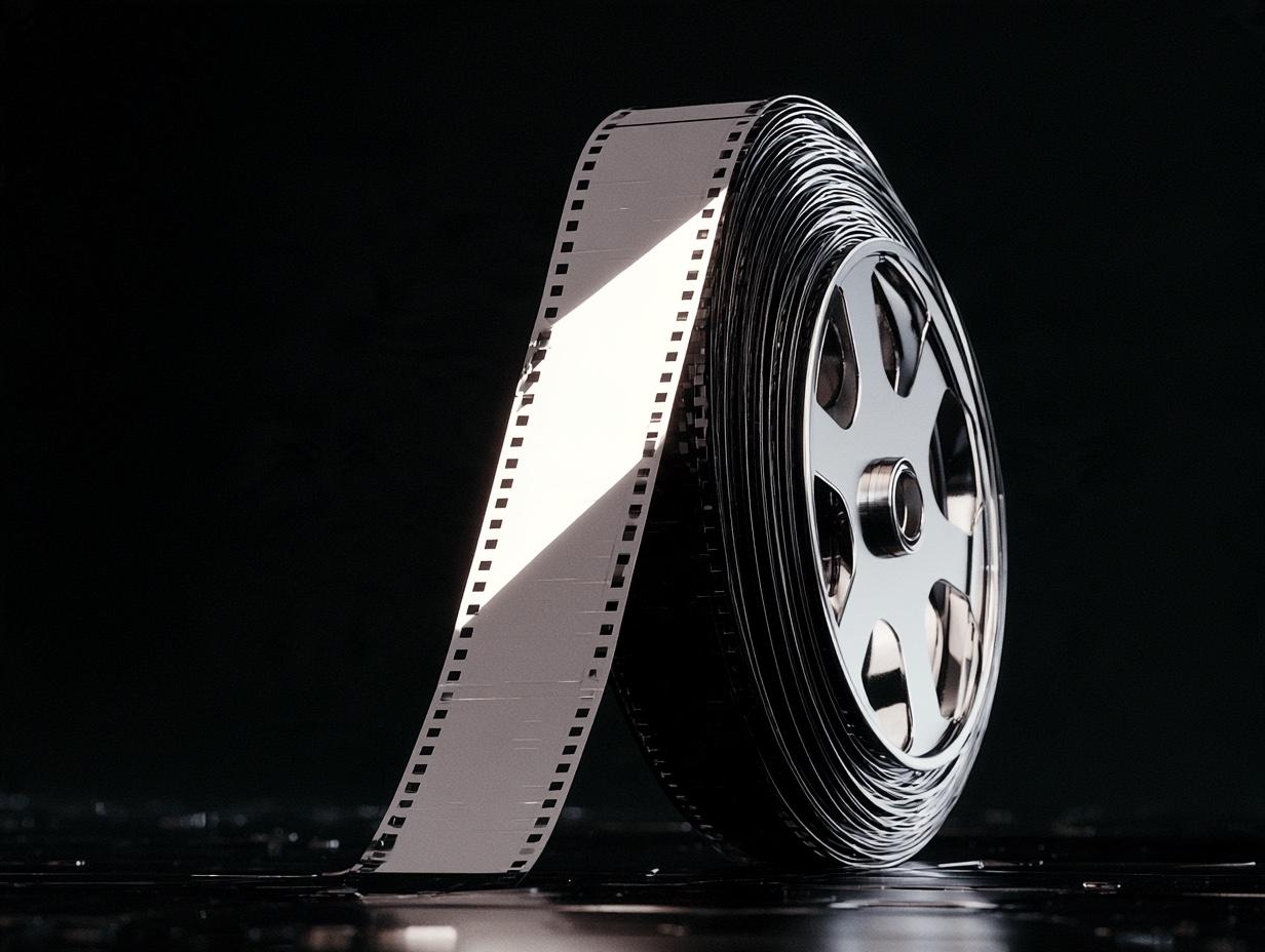
"Cinema relies on the image lingering on the retina" is a sentence that still sits in textbooks, and it is wrong. In 1993, Joseph and Barbara Anderson traced the source of this "persistence of vision" myth in the Journal of Film and Video and showed it to be invalid: an image lingering on the retina would produce blur, not motion. The real explanation of the sense of motion is the "phi phenomenon" that Max Wertheimer published in 1912: between two static stimuli shown in succession, the brain constructs a movement that is not there. Gestalt psychology was born with this experiment; cinema is explained by it too.
The numbers also give the lie to the myth. Film is shot at 24 frames per second, but the projector shows each frame by flashing it two or three times; the screen goes dark 48 or 72 times a second. The reason is the critical flicker fusion frequency: on a bright screen, the eye notices flicker below 50 times per second. For motion, 24 frames are enough; for the eye, 24 flashes are not. When Eadweard Muybridge proved in 1878, with twelve cameras, that all four feet of a galloping horse are in the air at the same moment, he had shown that motion could be divided into frames; thirty-four years later, Wertheimer showed how the frames turn back into motion.
3. Motion steals attention
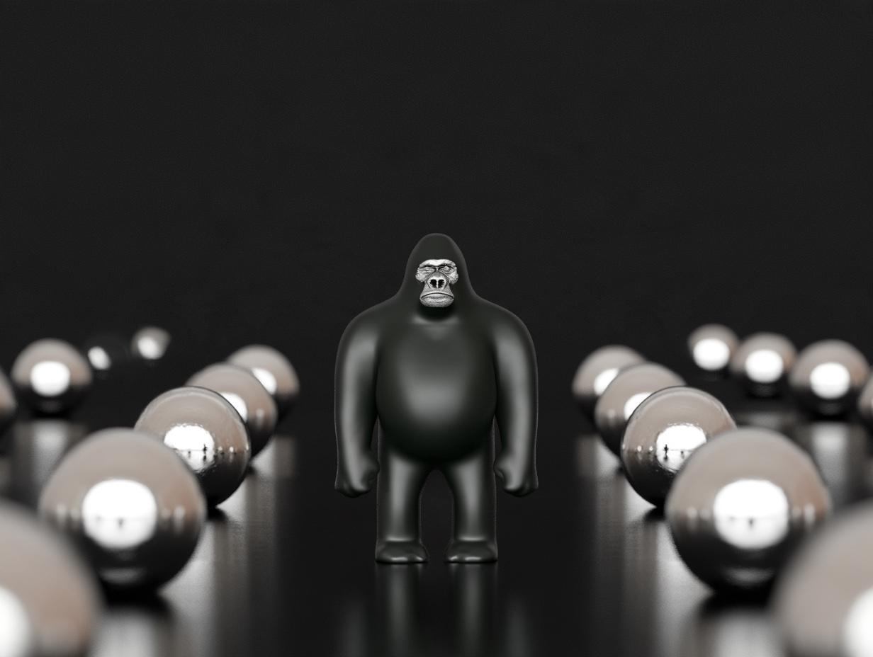
In 1999, Daniel Simons and Christopher Chabris asked participants to count basketball passes; halfway through the video, someone in a gorilla suit walked across and beat their chest. About half of the viewers did not see the gorilla. A year earlier, in Simons and Daniel Levin's door experiment, a researcher talking to passersby was swapped for someone else behind a door being carried between them; half of those talking did not notice the change. The two experiments say the same thing: attention is like a spotlight, and everything outside where it points is dark.
The power of motion is that it forcibly turns this spotlight. Peripheral vision is specialized for motion; in evolutionary terms, whatever approached from the edge was a predator. That is why the smallest element twitching in the corner of a page beats the most important text in the middle. In motion design this is both a power and a cost: motion is the designer deciding where the user will spend attention, and every unnecessary movement is attention stolen from the real message.
4. The animated logo, measured
In 2014, Luca Cian, Aradhna Krishna, and Ryan Elder measured the concept of "dynamic imagery" in the Journal of Marketing Research: logos that imply motion while remaining static (slanted shapes, shapes with flow lines, shapes that freeze a moment) produced higher engagement and a more favorable brand attitude in viewers; the effect depended on the logo "moving" in a direction consistent with the product's promise. In 2016, Adam Brasel and Henrik Hagtvedt tested genuinely animated logos in the Journal of the Academy of Marketing Science: motion increased excitement about and engagement with the brand, but only if the motion was congruent with the brand's character; incongruent motion lowered the evaluation.
The conclusion is that motion is not an ornament on identity but part of it. If an insurance company's logo bounces in, it says the wrong thing; so does an energy drink's logo fading in slowly. The direction, speed, and acceleration of motion carry the promise as much as color and form do.
5. Disney's twelve principles are a physics lesson

In 1981, two of Disney's master animators, Frank Thomas and Ollie Johnston, wrote down in The Illusion of Life the twelve principles the studio had distilled over fifty years. "Squash and stretch" describes a ball flattening when it hits the ground, but its real rule is the preservation of volume; "anticipation" says that every movement has a small beginning in the opposite direction; "slow in and slow out" says that no object goes from zero to full speed instantly. These are not cartoon rules; they are Newton's laws of motion translated for the eye, and the eye finds motion without acceleration fake.
In a digital interface the same principles are written as curves and durations. In 2001, Robert Penner put "slow in and slow out" into code with the easing equations he wrote for Flash; CSS does the same thing today with a cubic Bézier curve. Google's Material design language drew a single standard curve out of years of testing, cubic-bezier(0.4, 0, 0.2, 1): it starts fast and ends softly, because the user wants to see immediately that the response has begun and to perceive calmly that it has ended. The durations are measured too: 150 to 200 milliseconds for a small element, 250 to 300 for a medium one, 300 to 400 for a full-screen transition. Anything longer makes people wait; anything shorter is invisible.
6. The cost of motion: the people it makes sick

Not every motion is good for everyone. The national survey that Yuri Agrawal and colleagues published in the Archives of Internal Medicine in 2009 showed that roughly 35 percent of adults over forty in the United States had experienced a disorder of the balance system at some point in their lives. For these people, parallax scrolling, large-scale zooming, and continuous loops produce dizziness and nausea. Web standards answered this in 2018: criterion 2.3.3 of WCAG 2.1 asks that animation triggered by interaction can be turned off; browsers pass the user's operating-system preference to the page through the prefers-reduced-motion query.
This is not an accessibility detail; it is design discipline: every motion must have a motionless counterpart, and that counterpart must not lose the meaning. An interface whose meaning is carried only by animation has been designed incompletely for a third of the population.
7. Motion is a token
Just as color and typeface are defined by numbers in an identity guide, so is motion: a few durations, one or two curves, rules for entering and exiting. Once these values are set, the website, the app, the social media video, and the trade-show screen speak at the same tempo; the viewer recognizes the brand even with the sound off. Motion left undefined turns into a different character at every agency and with every developer, and the incongruence penalty that Brasel and Hagtvedt measured is charged.
8. The motion protocol in the studio
Our protocol begins with four numbers: three durations of 120, 240, and 400 milliseconds, and a single standard curve. A logo opener does not exceed two seconds, and its final frame is the static logo itself; it is loop-tested so that it does not tire on the hundredth viewing. Every animation is measured against a 60-frame budget; a movement that drops frames is simplified, and "a more powerful machine" is not accepted as an answer. A reduced-motion counterpart is designed for every movement, and the loss of meaning is checked. The last question is Cian and colleagues' question: is this motion going in the same direction as the brand's promise?
Doherty and Thadani's 400 milliseconds still say the same thing forty years later: people love a system that keeps up with them. Motion design is how a brand keeps up with the user.
References
Doherty, W. J. & Thadani, A. J. (1982). The economic value of rapid response time. IBM Systems Journal / IBM technical report GE20-0752.
Miller, R. B. (1968). Response time in man-computer conversational transactions. AFIPS Fall Joint Computer Conference, 267–277.
Card, S. K., Robertson, G. G. & Mackinlay, J. D. (1991). The information visualizer: An information workspace. CHI '91, 181–186; Nielsen, J. (1993). Usability Engineering. Academic Press.
Anderson, J. & Anderson, B. (1993). The myth of persistence of vision revisited. Journal of Film and Video, 45(1), 3–12.
Wertheimer, M. (1912). Experimentelle Studien über das Sehen von Bewegung. Zeitschrift für Psychologie, 61, 161–265.
Simons, D. J. & Chabris, C. F. (1999). Gorillas in our midst: Sustained inattentional blindness for dynamic events. Perception, 28(9), 1059–1074.
Simons, D. J. & Levin, D. T. (1998). Failure to detect changes to people during a real-world interaction. Psychonomic Bulletin & Review, 5(4), 644–649.
Cian, L., Krishna, A. & Elder, R. S. (2014). This logo moves me: Dynamic imagery from static images. Journal of Marketing Research, 51(2), 184–197.
Brasel, S. A. & Hagtvedt, H. (2016). Living brands: Consumer responses to animated brand logos. Journal of the Academy of Marketing Science, 44(5), 639–653.
Thomas, F. & Johnston, O. (1981). The Illusion of Life: Disney Animation. Abbeville Press.
Penner, R. (2002). Programming Macromedia Flash MX (easing equations); Material Design motion guidelines (standard curve and durations).
Agrawal, Y., Carey, J. P., Della Santina, C. C., Schubert, M. C. & Minor, L. B. (2009). Disorders of balance and vestibular function in US adults. Archives of Internal Medicine, 169(10), 938–944.
W3C (2018). WCAG 2.1, criterion 2.3.3 Animation from Interactions; CSS prefers-reduced-motion.
More articles
All articles →Previous article

Light Is an Equation: on the physics of 3D visualization
Fresnel's 1823 equation, Debevec's chrome sphere, IKEA's rendered catalog: the physics and perception research behind photorealistic 3D product visualization.
October 2026
Next article
Why Blue Wins: on the universality and ownership of color
The dress that split 1,401 viewers, the world's ugliest color, and Louboutin's red sole: the science of color perception and how a brand comes to own a hue.
October 2026